
While it may seem trivial to some, I do think it is worthwhile to put some effort into the selection of the font in which my thesis will be written and ultimately printed. For reasons of aesthetics and ease of reading, a fairly classical serif font is the sort being considered. Within that genre, there are three options I am considering most strongly at the moment.
Garamond
In many ways the font to beat, Garamond is elegant and legible. The biggest problem with it is that it has become somewhat generic – the standard improvement upon the ubiquitous Times New Roman.
Bembo
Actually a predecessor of Garamond, Bembo was cut by Francesco Griffo, and first printed in February 1495. It was first used in a book about a journey to Mount Aetna written by Italian Cardinal Pietro Bembo. Notably, it was used as the typeface in the hardback edition of Alan Hollinghurst‘s Booker Prize winning novel The Line of Beauty.
Perpetua
Originally designed for a limited edition copy of The Passion of Perpetua and Felicity, this typeface was also used in Margaret Atwood’s Moral Disorder (written about here previously).
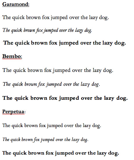
Here, you can see all three in one image file: Garamond, Bembo, and Perpetua. Anyone interested should feel free to comment or register their preference.
I think Garamond is the most popular for a reason. Bembo looks a bit too vertically extended, and Perpetua seems a bit constrained. The white spaces between lines overwhelm the letters. That said, I like the italic version of Perpetua best.
Garamond has the nicest lowercase Q, whereas the Bembo J is a bit off-putting. The Garamond italic Z is awful, though the Bembo version is actually pretty cool.
Perpetua is probably the rarest. Given that 95% of people will see no difference between these three, you may want to go with that one, just to give font-heads a thrill.
(I don’t think the third line of Garamond in the sample of all three is actually bold.)
I don’t think the third line of Garamond in the sample of all three is actually bold.
Fixed.
I agree about how nice italic Perpetua is. Just compare the word ‘lazy’ in the three font image to see why.
I would certainly go for Bembo: Garamond is too stylized in cases (see previous references to the italicized ‘z’, among other problems); Perpetua strikes me as a bit cramped and softspoken; and Bembo is simple, confident, and elegant. Who knows — the psychological effect could push you into the distinction range.
Of the three, I like Perpetua the most when it is presented as a single line – as in the three font image – but the least when it’s in paragraph form. That said, it would be better with 1.5 spacing, if that is allowed.
My vote is for Garamond. How often are you going to use italics, anyhow?
All these seemed to come out as Times New Roman on the minimac. Although the publishedbound copy will have your font of choice , you might want to double check that the printers have the font and it won’t affect the charges ( I know it shouldn’t but you never know what they’ll charge for). If your supervisor will be reading an electronic copy, its a good idea to use a typeface he’ll be likely to be reading it in (and it seems unlikely he’d have the latter two).
Antonia,
The links go to JPG images of the fonts and test paragraphs in question, because hardly anyone will have Bembo or Perpetua installed.
The differences are subtle.
I’ve spoken with the Hollywell Print Shop and they will happily use whatever font you like, so long as it is embedded in the PDF document you give them to print. Font-embedded PDFs will also work for my supervisor, though he prefers for me to send material in printed form anyhow.
I can tell you really dig the Garamond-ish look but I am a huge fan of Georgia.
Maybe it just reminds me of the typeface used by Foreign Affairs.
But it is a much more drastic change than the above options.
Of the three choices listed I would take Perpetua.
Perpetua looks a bit small to me, but I think I’m one of the 95% who don’t care.
Scott,
Georgia certainly isn’t bad, though it looks like a newspaper font to me.
Ben,
Having nearly finished writing my first chapter draft in Perpetua, I have decided that I rather like it. While I am not committed, it is the front runner at the moment.
That said, I have been writing it at 150% scale. I will need to see how it looks printed before I can really decide.
Ignore Scott…and stick with what you have :)
You should print them off and decide on that basis. The screen look might count for editing, but it’s the printed copy the examiners will be dealing with.
Perpetua looks really nice printed, though it is a little bit on the small side.
I think that Perpetua is the most classy and looks wonderful in italics. I also doesn’t look so crowded and is gentle on the eyes.
I am also a Georgia fan.
Perpetua reminds me the most of you. (your handwriting, your personality, etc. — it seems natural that it would be your front runner.) I prefer Bembo, but i think it is more like me than it is like you. I mean as much as incredibly similar fonts can be “like” someone. I would prefer to read Bembo, I find it more aesthetically pleasing, but I think Perpetua would be a good choice for you.
You may be interested in learning the fonts The Economist uses:
Officina and Ecotype
WhatTheFont is a website that will tell you what font is used in a jpg image you upload. It might be very helpful to people.
Great film speeches as animated text
Periodic table of typefaces (jpg)
Our Favorite Typefaces of 2008
Typographica on April 16, 2009
Sensationalism aside, it’s significant that the ever-increasing quality in type design these days — dubbed by some as the new “golden age” of type — has caused this year’s list to supersede previous lists in many ways. For example, the new larger format of the site accommodates larger type specimens, appropriately showing more of each typeface’s beautiful features. It’s also worth noting that the list presents more selections than in years past — a testament to the fact that there are simply more quality typefaces being produced, and at a faster rate than before (many of which we were sad to leave out). Finally, in accordance with the increased number of worthy choices, more contributors have offered their opinion than ever before. From type educators to expert users of type, type critics, type historians, type technicians, and type designers themselves, a wide range of relevant perspectives are presented for consideration.
Down With Verdana!
Typography on the Web is basic and dull. A startup called Typekit will fix it.
By Farhad Manjoo
Posted Monday, July 13, 2009, at 5:19 PM ET
For typography geeks, the Web is a depressingly drab place. Just look around the page you’re reading now: There are only a couple of fonts, Arial and Verdana, used to display most of the text. That would be fine, except that they’re the same two fonts you find everywhere else on the Web. Don’t blame Slate’s design team for the shortfall; blame the people who build Web browsers, the Web’s standards bodies, and the companies that sell fonts. The strange reality of the Web is that it’s harder to display a novel font than it is to embed a video. In this realm, at least, print media are still way ahead. Flip open your favorite glossy magazine and behold the typographic bounty—the text sizes that range from the microscopic to the gargantuan, the huge variety of font weights and styles, and the thrillingly large universe of different typefaces. Compared with the typical issue of Cosmo, Slate and every other online magazine look like something out of the 1800s.
There are some interesting typeface related aspects to the Toronto subway system. This article discusses some of them.
Personally, I like the sharp-topped ‘A.’
I also enjoy Toronto subway fonts. Have you seen Helvetica? It is quite a good film about fonts, culture, theory, history.
Helvetica
April 21, 2007
Someone has been reading my site in automatically translated Arabic. I must admit, it is elegant-looking that way.
Do typefaces really matter?
To most people, typefaces are pretty insignificant. Yet to their devotees, they are the most important feature of text, giving subliminal messages that can either entice or revolt readers, says Tom de Castella.
When Avatar, the biggest grossing movie of all time was released, one section of the audience was immediately outraged.
Graphic designers hated it. Why? They didn’t like the font that director James Cameron had chosen for the subtitles.
“I hated it on the posters and then threw up a little in my mouth when I realised I would have to read that ugly font throughout the film in the subtitles,” one blogger commented.
“After the hundreds of millions of dollars spent on CG effects, did he just run out of money for a decent graphic designer?”
And yet fonts are not just for geeks. Otherwise why would organisations around the world spend so much time and money changing their typeface?
The man who invented Verdana, Georgia and new typefaces for The New York Times and Wired has just released a font bearing his name: Carter Sans. Breathlessly awaited by the industry, Carter Sans made its pre-debut last fall at a New York gala for the Art Directors Club Hall of Fame.
Though Carter has said he doesn’t consider himself an artist, to font-fetishists, the Carter Sans is a thing of beauty: solid, vigorous, with just the slightest whiff of serif (the small flares at the ends of the letter). The “stroke endings show the effect of the chisel more than the pen,” Carter has said, poetically.
While Carter gets his deification, and a 2007 documentary on Helvetica becomes an art-house hit, handwriting appears to be a dying art. In the book Script and Scribble: The Rise and Fall of Handwriting, Kitty Burns Florey recounts how, in the 18th century, writing masters urged six to 12 hours a day of practice. But in 2006 only 15 per cent of students taking the SAT wrote out their essays in cursive script, with the other 85 per cent using block letters. Learning cursive takes up less time in classrooms these days, as “keyboarding” becomes the educator’s priority.
Butterick’s Practical Typography