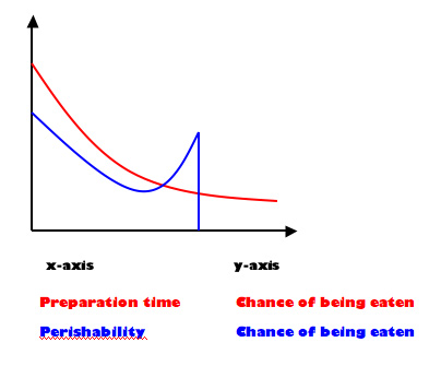
The above demonstrates why I find myself eating so many Kimchi Noodle Bowls and cheese sandwiches. It also helps to reveal why the avocados I eat tend to be either unripe or over-ripe, though the shape of the blue curve is the inverse of what would be rational (barring the sheer drop at the end).
Author: Milan
In the spring of 2005, I graduated from the University of British Columbia with a degree in International Relations and a general focus in the area of environmental politics. Between 2005 and 2007 I completed an M.Phil in IR at Wadham College, Oxford. I worked for five years for the Canadian federal government, including completing the Accelerated Economist Training Program, and then completed a PhD in Political Science at the University of Toronto in 2023.
View all posts by Milan

Presently, a large part of my diet consists of things that can be made with just a kettle (cous cous, noodles and cup-a-soup featuring prominently). I wonder if I can put that on a graph…
It is funny to see how Word thought one of the words in the graphic above was incorrectly spelled, and that the wiggly underline made it into the web-displayed JPEG.