
With a couple lost to the CUPE 3902 strike, I taught twelve sets of tutorials this year.
The histogram below shows how many students attended more than any particular number of tutorials:
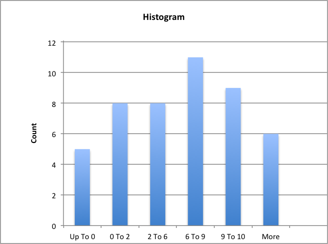
Any thoughts on the distribution? It looks approximately unimodal and symmetrical, with the largest number of students having attended six to nine of the twelve tutorials. Students were free to attend any tutorial they wished, but these numbers include students who missed their normal tutorial and attended an alternative one.
This histogram shows active participation in tutorials:
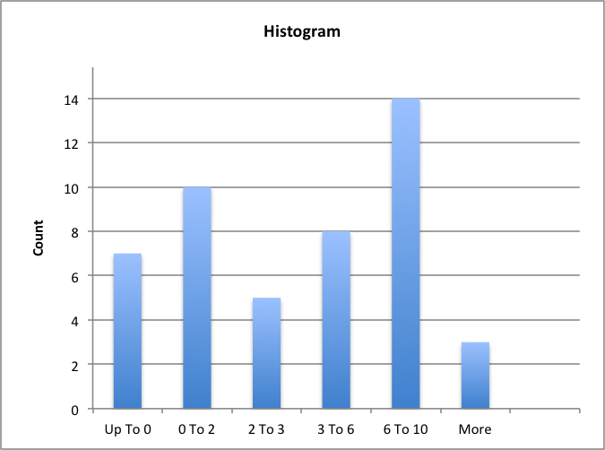
Students who contributed to the conversation either spontaneously or when prompted, or who demonstrated knowledge of the readings, were coded as ‘active’.
If I could change anything for next year, it would be to do more to shrink those first two categories in the participation chart.