
Perhaps the biggest question about global warming is what environmental economists refer to as ‘the shape of the damage curve.’ I would say that the scientific evidence that global warming is taking place is essentially ironclad (though the relationships of some events, such as more severe hurricanes, to it are rather more tenuous). Equally true is the fact that human beings are contributing to the warming of the planet. What the damage curve represents is the amount of harm caused by each additional unit of global warming, expressed in terms of the cost that would be required to mitigate it. Mitigation costs include everything from relocating people to dealing with larger malarial areas, making agricultural changes, and increased building heating and cooling costs in different areas. The costs are net of any benefits that global warming provides: such as being able to grow certain crops farther north, or having a longer growing season overall.
The most benign possibility would look something like this:
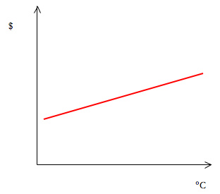
The damage increases steadily with the amount of mean global temperature change. This is helpful because it allows us to predict the degree of future damage quite effectively and make reasonably good choices with regard to how much reduction in greenhouse gas (GHG) emissions we should undertake.
A worse option looks like this:
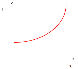
The damage increases at an increasing rate, as temperature does. This seems intuitively more likely than the first option, since bigger increases are likely to unbalance more and more complex biological and climatological systems.
An even worse option looks like this:
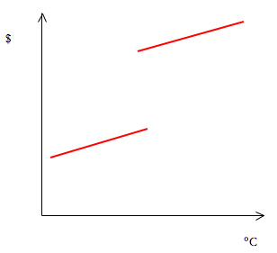
It is possible that climate change would involve a big jump that we wouldn’t see coming until it was too late. An example would be the much talked about possibility that the Gulf Stream, which warms Western Europe, could be disrupted. The biggest reason this is problematic is because we might believe we were in a scenario like the one in chart one, only to be proved spectacularly wrong.
The trillion dollar question, of course, is which of these approximations we should adopt as the basis for policymaking, until such a time as compelling evidence for one of the possibilities or another emerges (hopefully not by means of humanity actually following one of those curves too far). The most cautious option is to assume that the progression would be like chart 3, with the break at an unknown location. The prudent policy, then, would be to try and stabilize GHG levels at their present positions. Of course, that could involve massive reductions in possibilities for economic growth in the rich world and poverty reduction in the poor world. A tricky decision to make, in the face of such important considerations on both sides.
Personally, I don’t think any serious action will be taken until some very real evidence of the harm that can be caused by global warming has manifest itself. As for the question of what should be done, in the ideal circumstance, I am profoundly uncertain. What do other people think?
An even trickier, but still vital question, is the distribution of these costs. If they are primarily borne by western corporations or people in states capable of dealing with extreme weather fairly well, that is one thing. If they are borne by the rural poor of India, that is quite another.
Obviously, that goes for both mitigation costs and damage costs.
As Neal pointed out, a titration curve like this one might be a better way of portraying option three, though it does assume a levelling off as the temperature change approaches infinity.
B,
I agree that the distribution of costs is highly relevant. As you say, however, it is even harder to sort out. A Rawlsian difference principle approach isn’t even a very helpful guide, because more GHG emitting economic growth stands a good chance of helping many of the least advantaged, making the choice to restrict GHG emissions for their sake a non-straightforward one.
BBC documentary on global dimming
A bit hyperbolic in its language sometimes, but very comprehensible.
For those about to tip…
September 3, 2009, 3:43 pm
This week’s Nature has a review article in it I have been waiting for for some time, and which I suspect may become something of a classic:
Marten Scheffer et al, Early-warning signals for critical transitions Nature 461, 53-59 (3 September 2009) | doi:10.1038/nature08227. Here’s the abstract
One of the problems with tipping points in complex systems is that straightforward analysis is incredibly unlikely to be precise and accurate about the tipping point’s threshold. A model may happily tell you that a system has a tipping point, bit it will not tell you where it is. In climate terms, you can be sure that there is a point at which the Greenland ice sheet will collapse, but you don’t know how far we are from it. This article reviews work which suggests a way round this. The system itself may tell you when it is getting close to a tipping point through subtle changes in the way its behaviour varies over time — in particular changes associated with “critical slowing”. What follows is my interpretation of the paper, which seems impressively approachable for a piece of mathematics, but which I may nevertheless be getting wrong; any real mathematicians in the audience should feel free to chip in in the comments.
November 15, 2009
Climate change catastrophe took just months
Jonathan Leake, Science Editor
Six months is all it took to flip Europe’s climate from warm and sunny into the last ice age, researchers have found.
They have discovered that the northern hemisphere was plunged into a big freeze 12,800 years ago by a sudden slowdown of the Gulf Stream that allowed ice to spread hundreds of miles southwards from the Arctic.
Previous research had suggested the change might have taken place over a longer period — perhaps about 10 years.
“Patterson, however, obtained mud deposits from Lough Monreagh, a lake in western Ireland, a region he says has “the best mud in the world in scientific terms”.
Patterson used a precision robotic scalpel to scrape off layers of mud just 0.5mm thick.Each layer represented three months of sediment deposition, so variations between them could be used to measure changes in temperature over very short periods.
Patterson found that temperatures had plummeted, with the lake’s plants and animals rapidly dying over just a few months. The subsequent mini-ice age lasted for 1,300 years.
What caused such a dramatic event? The most likely trigger is the sudden emptying of Lake Agassiz, an inland sea that once covered a swathe of northern Canada.
It is thought to have burst its banks, pouring freezing freshwater into the North Atlantic and Arctic oceans, disrupting the Gulf Stream, whose flows depend on variations in temperature and salinity.
A single year’s disruption in the Gulf Stream could have been enough, said Patterson, to let ice grow far to the south of where it usually formed. Once it had taken over, the Gulf Stream was unable to regain its normal route and the cold took hold for about 1,300 years.”
The rise in global temperatures which began towards the end of the 20th century slowed increases in productivity, but it did not stop them. A recent study by researchers at Cornell University calculates that, since 1971, climate change resulting from human activity has slowed growth in agricultural productivity by about a fifth.
The “headwind” caused by climate change will only become stronger, says Ariel Ortiz-Bobea, one of the study’s authors. Their research found that the sensitivity of agricultural productivity increases as temperatures rise. In other words, each additional fraction of a degree is more detrimental to food production than the last. That is especially bad news for food producers in places, such as the tropics, that are already warm. Another study predicts that for every degree that global temperatures rise, mean maize yields will fall by 7.4%, wheat yields will fall by 6% and rice yields will fall by 3.2%. Those three crops supply around two-thirds of all the calories that humans consume.