
It is nearly always interesting to see complex data presented in a new way – particularly as a visualization. The way this one arose was actually very mathematical, based on equations for modeling the strength of electromagnetic fields.
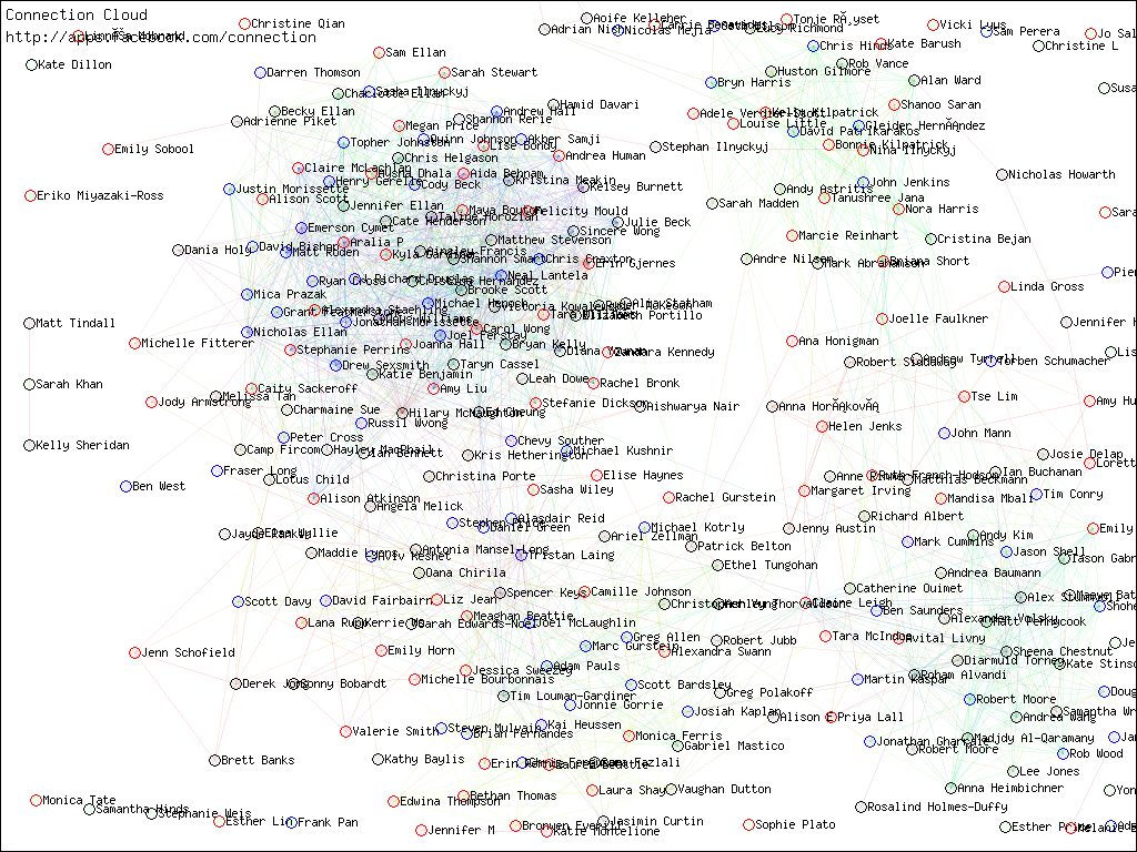
The dense cluster on the left is a tangle of high school and undergrad. The much smaller grouping on the right is Wadham College, Oxford. All around the edges and bottom are relatively or entirely isolated people – evidence of how many people I meet and random and at a sufficient level to warrant a Facebook linkage.
Here is a much higher resolution projection. It looks a bit like a fringed galaxy.
This visualization software was created by Steve Cholewiak.
In the big image, two more distinct clusters are visible: the Oxford M.Phil in International Relations class of 2007 and the Oxford University Walking Club.
Who is that ‘Nina Ilnyckyj’ in the middle of the Wadham College group?
My how this has grown.
(Scroll down to ‘Milan Ilnyckyj’s Facebook Web’)