
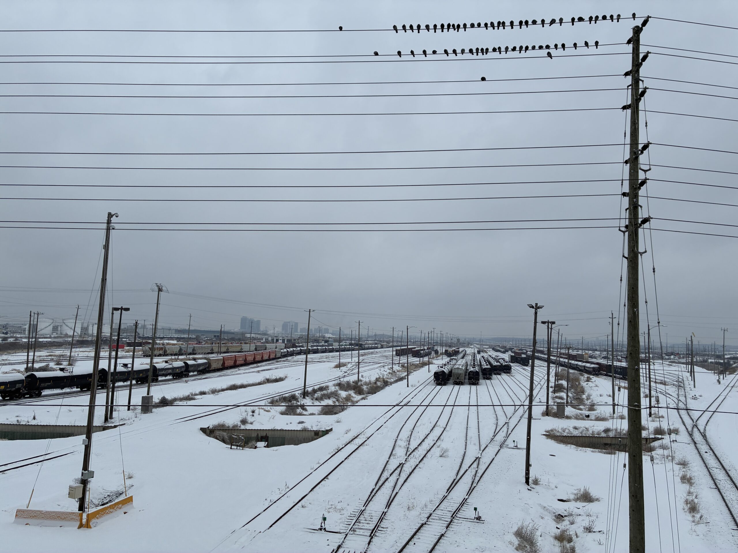
One bike out of the ravines and back in the network
Photo by Ilana
climate change activist and science communicator; photographer; mapmaker — advocate for a stable global climate, reduced nuclear weapon risks, and safe human-AI interaction

One bike out of the ravines and back in the network
Photo by Ilana
‘What does love have to do with it?’ asked the late Pier Giorgio Di Cicco in his 2007 book, Municipal Mind: Manifestos for the Creative City. He was Toronto’s second poet laureate, from 2004 to 2009, and the book is his legacy project from that time. Di Cicco had a passionate, sometimes combustible-seeming connection to Toronto. A practicing Catholic priest, he wore black leather jackets and turtlenecks, smoked cigarettes, and spoke with a fantastic gravelly voice. A cool priest even, cooler than I ever knew from thirteen years of Catholic school. ‘A town that is not in love with itself is irresponsible, and civilly apt for mistakes,’ he wrote. ‘A citizenry is incited to action by the eros of mutual care, by having a common object of love — their city. A town that is not in love with itself will cut corners; lose sight of the common good.’
Love is also something you would be hard-pressed to find in official city statutes, but ask yourself if you love Toronto or whichever city you live in. Often the answer is no: cities are frustrating, but how can we care about something we don’t also love? In a section of Municipal Mind called ‘Restoring the Soul to the City,’ Di Cicco tried to conjure a Toronto that could be — something we could aspire to. ‘Developers are generally not known for their philosophical bent, but for their market enthusiasm,’ he wrote. ‘But it was a developer who told me the truest thing about cities: Speaking of Florence, a place that revitalized a civilization by a standard of civic care and design excellence, my friend remarked, “You know, Florence was already there, before a building ever went up.”
Toronto is certainly not Florence, and those with little imagination will dismiss the poetry about a city as useless, but Di Cicco was encouraging us to dream up an ideal Toronto that could be something to strive for as this place continues to grow and change. It could be about the architecture, but it also could be the sidewalks, more equitable and affordable housing, lusher parks, or ample public washrooms. Is Toronto living up to the city we dream of? From Di Cicco’s point of view, these collective ideals and visions are what make Toronto beautiful, rather than the stuff already built. It’s possible to dream of a better Toronto even while loving the current one. Perhaps it’s the only way to dream.
Micallef, Shawn. Stroll: Psychogeographic Walking Tours of Toronto. Updated Edition. Coach House Press, 2024. p. 15
Contrast with: This uncivil city

A new, cool style of engaging and enjoying metropolitan realities has recently emerged in Toronto among certain young writers, artists, architects, and persons without portfolio. These people can be recognized by their careful gaze at things most others ignore: places off the tourist map of Toronto’s notable sights, the clutter of sidewalk signage and graffiti, the grain inscribed on the urban surface by the drift of populations and the cuts of fashion.
Their typical tactic is the stroll. The typical product of strolling is knowledge that cannot be acquired merely by studying maps, guidebooks, and statistics. Rather, it is a matter of the body, knowing the city by pacing off its streets and neighbourhoods, recovering the deep, enduring traces of our inhabitation by encountering directly the fabric of buildings and the legends we have built here during the last two centuries. Some of these strollers, including Shawn Micallef, have joined forces to make Spacing magazine. But Shawn has done more than that. He has recorded his strolls in EYE WEEKLY, and these meditations, in turn, have provided the raw material for the present book. The result you have in your hands is a new introduction to Toronto as it reveals itself to the patient walker, and an invitation to walk abroad on our own errands of discovery, uncovering the memories, codes, and messages hidden in the text that is our city.
Foreward from first edition, Toronto, 2010
John Bentley Mays, 1941–2016
Micallef, Shawn. Stroll: Psychogeographic Walking Tours of Toronto. Updated Edition. Coach House Press, 2024. p. 7
Terrifying news: the Ontario government wants to make it easy for landlords to evict tenants at will.
It’s stuff like this that makes the future terrible to contemplate. The system is already horrendously abused by landlords. Housing stress has been one of the worst parts of my life ever since I moved here. Policy choices like these understandably make people afraid about whether they will be able to have a future at all.
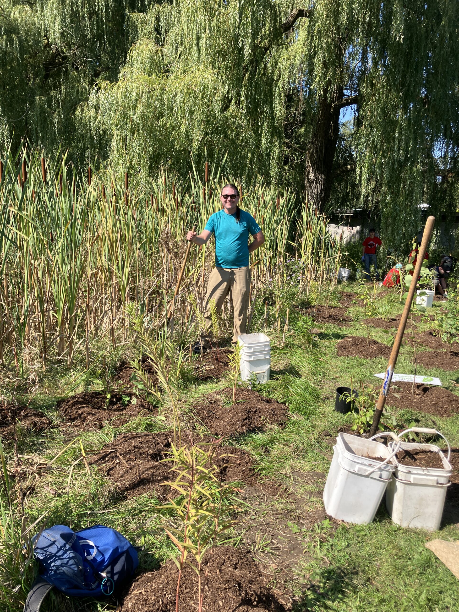
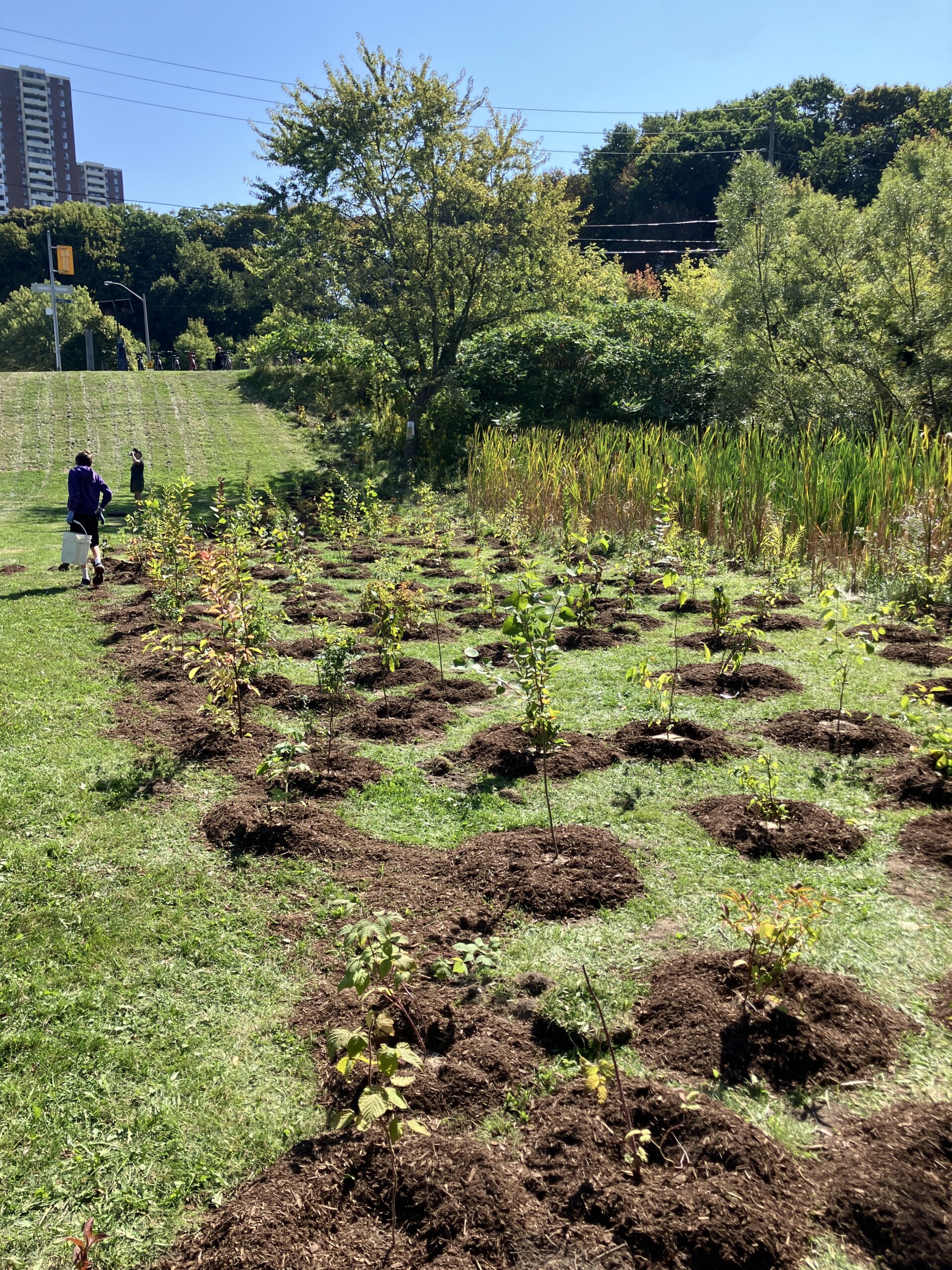
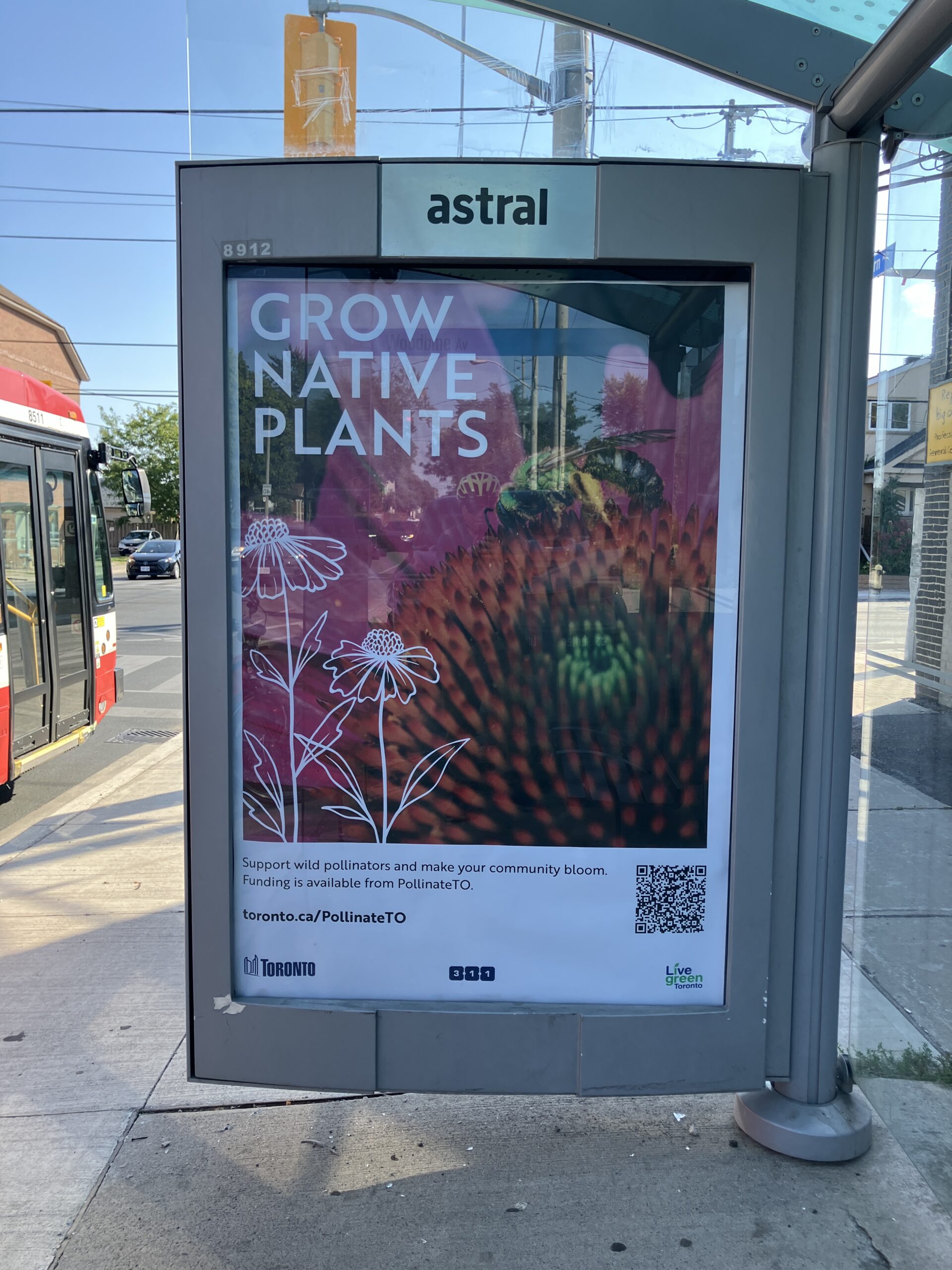
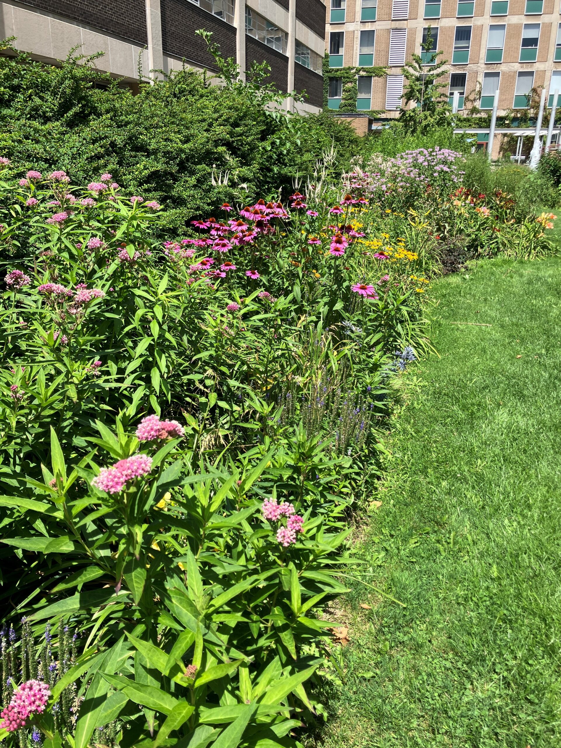
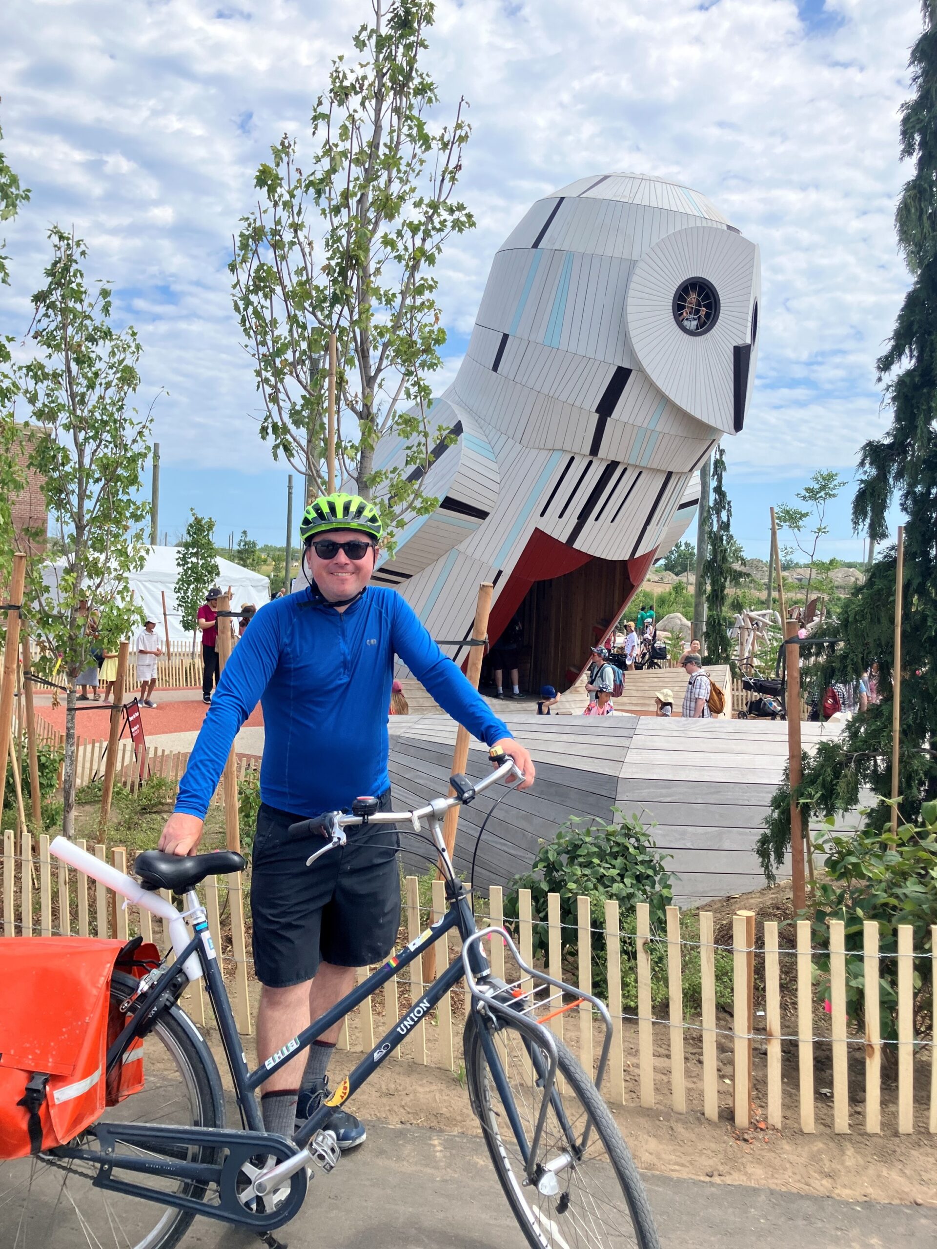
Photo by Jess
I had a great Saturday. It was cool enough not to be oppressive, and I was able to ride down the Don past the Brickworks to the new Biidaasige (bee-daw-sih-geh) Park. The park is very impressive. They have turned the engineered, industrial, concrete landscape around the mouth of the Don River into a real human space again, and an alluring one. There is a large outdoor adventure playground with ziplines, charmingly rendered animal play sculptures, and two-story high treehouses shaped like a raccoon and an owl, the latter of which has a tiny amphitheater in front. Within a large landscape of springy concrete, kids can use human-powered pumps to move water into a simulated watershed with controllable floodgates and sand areas to play in. There are curving paths along the new rivercourse, which is lined thickly with native plants. There are also boat launches and fishing spots.
The park grand opening was happening just a short ride from the Neon Riders BBQ, so I was able to see some friends there and bring one back for another ride through Biidaasige Park. After that, another friend from the Riders had a charmingly creative and playful music gig in Bickford Park, which was further enriched for me by a pair of very friendly dogs who were part of the small audience.
A river mouth should be a geographical anchor and natural point of interest. As someone who has walked extensively all over Toronto, the way the Don came to an end failed to satisfy those expectations. With Corktown Common, Biidaasige Park, and the other park areas still in progress, the city is doing a great job at making the river mouth part of the human landscape again. I have thought for years that Toronto’s greatest planning blunder was cutting off the city from the lake with the Gardiner Expressway. Personally, I would be fine with getting rid of the whole thing through the mechanism of less driving downtown, but while we are waiting it’s great that at least the river is being reclaimed.
The ziplines all had long lines of small children on Saturday, so I will need to return when things are less crowded. I expect Biidaasige Park to become a popular break spot for Neon Rides.
P.S. At an arts and crafts station, I was taught to make ‘seed bombs’ out of dirt, pottery clay, and heirloom open-pollinated seeds of Common Evening Primrose (Oenothera lamarckiana) from the Ecoseedbank in Montreal. The flowers are native to the region and good for pollinators, and the initiative reminds me of charming videos of dogs who help re-seed the forest after fires in Chile.
I’m excited about Toronto’s launch of Biidaasige Park tomorrow. How often does a city get a big new area of green space, and in as geographically and ecologically important a place as a river mouth?